
Project Implementation Overview
Click the arrow mark to watch the video in full screen
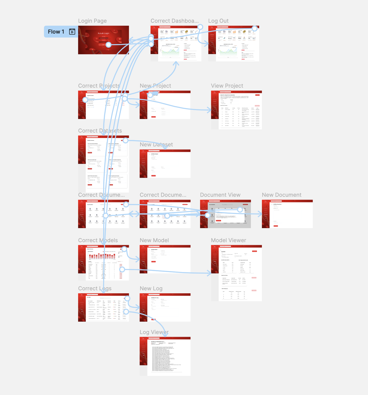
Designing the dashboard started with understanding what researchers really needed. I dug into their workflow pain points, explored different project structures and dataset types, and mapped out key factors like accuracy, latency, and memory usage to ensure the data was presented in the most useful way. With these insights, I sketched out low-fidelity wireframes, refining them through multiple feedback loops to create an intuitive and efficient UI. Once the structure felt right, I designed high-fidelity wireframes in Figma, adding a clean navigation bar, a seamless layout, and smart documentation tracking to keep everything organized. The result? A dashboard that cuts out manual tracking, visually structures research data, and makes analyzing models faster and more intuitive.
One challenge was ensuring that sample placeholder data was relevant to the Biomedical and AI context while respecting confidentiality. Since I couldn’t include direct research data, I: Scouted various biomedical projects and datasets to extract relevant non-sensitive sample descriptions. Ensured AI-related terminologies and configurations accurately reflected real-world biomedical AI research. Created realistic test cases that aligned with the actual research being conducted in the lab. For the design language, I opted for: A lab-friendly red color palette with subtle UI elements, maintaining a scientific and professional feel. A structured hierarchy that mirrored the way AI researchers organize experiments and analyze performance. AI-driven enhancements, where I applied my understanding of AI workflows to optimize UI layouts for AI researchers, ensuring that key metrics and logs were always accessible without overwhelming the interface.

This project pushed my skills beyond UI/UX and AI into a multi-disciplinary blend of three domains—Biomedical Research, Artificial Intelligence, and User Experience. Some of the key challenges I overcame included: Creating a universal structure that worked for various research projects, despite their diverse methodologies. Designing an interface that balanced complexity with usability, ensuring it remained researcher-friendly while supporting intricate configurations. Optimizing data visualization, so that performance benchmarks and model logs were both insightful and non-cluttered. This project reinforced my ability to bridge technical and design-driven problem-solving, proving that a well-designed UI/UX can significantly improve research efficiency. It also gave me the confidence to handle even more complex UI/UX designs, incorporating faster rendering techniques and AI-driven design improvements for future projects. Scroll down to explore more insights into the design process and dashboard features.


